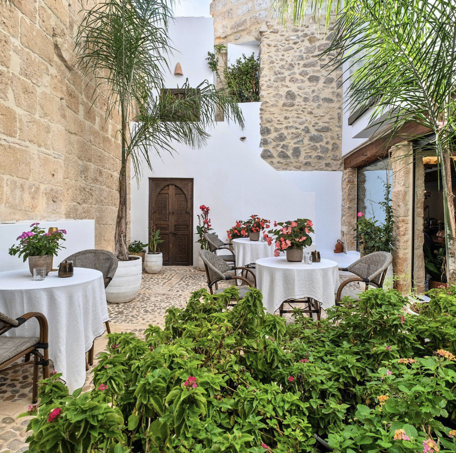
A serenity hostel in Teulada, Spain
From the Group Terra de Mar, this hostel offers a calming and healing experience with a touch of exotic vibes. They needed a logo that could represent this essence.
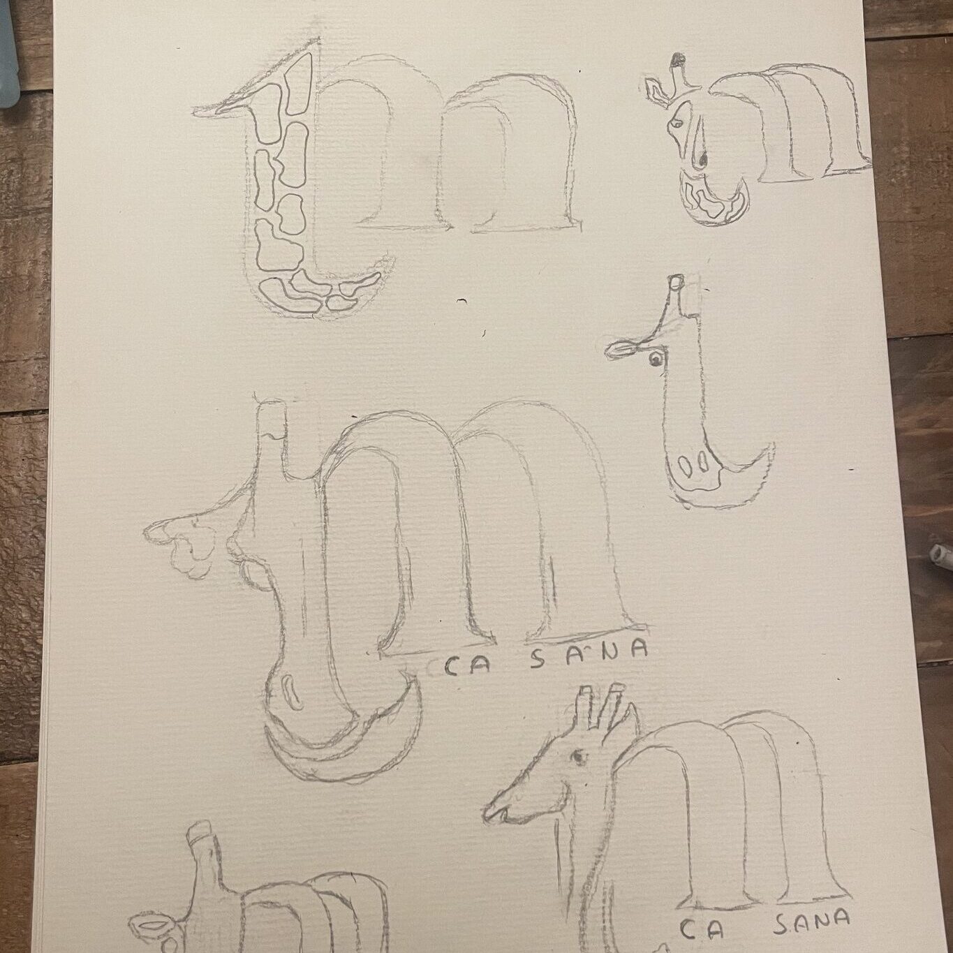
First sketches
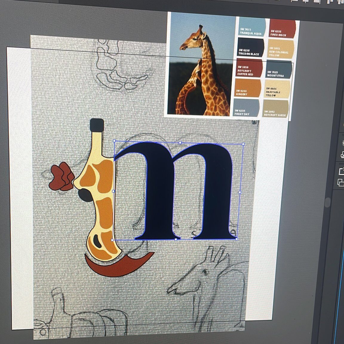
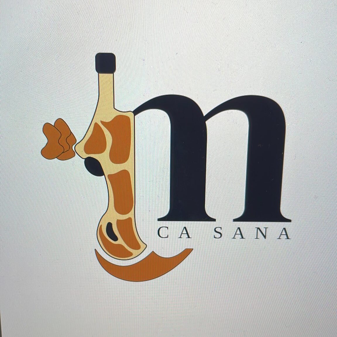
I wanted to create something that reflects the exoticness while preserving the original essence of the Terra de Mar group. That’s why I designed this logo, keeping the original “m” and changing the “t” to the shape of a giraffe. Giraffes are a distinctive element at Ca Sana Accommodation, and I decided they would fit perfectly with the brand image.
Vectorice it
After considering a few options, the client decided to go with this one. It was time to move into Illustrator and create a vector version. I also added colour, choosing a giraffe-inspired palette to ensure I captured the correct look and feel.
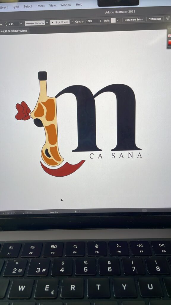
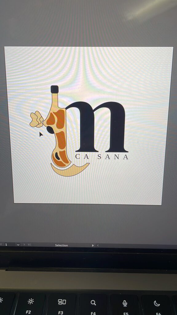
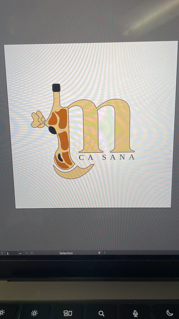
Colour Variations
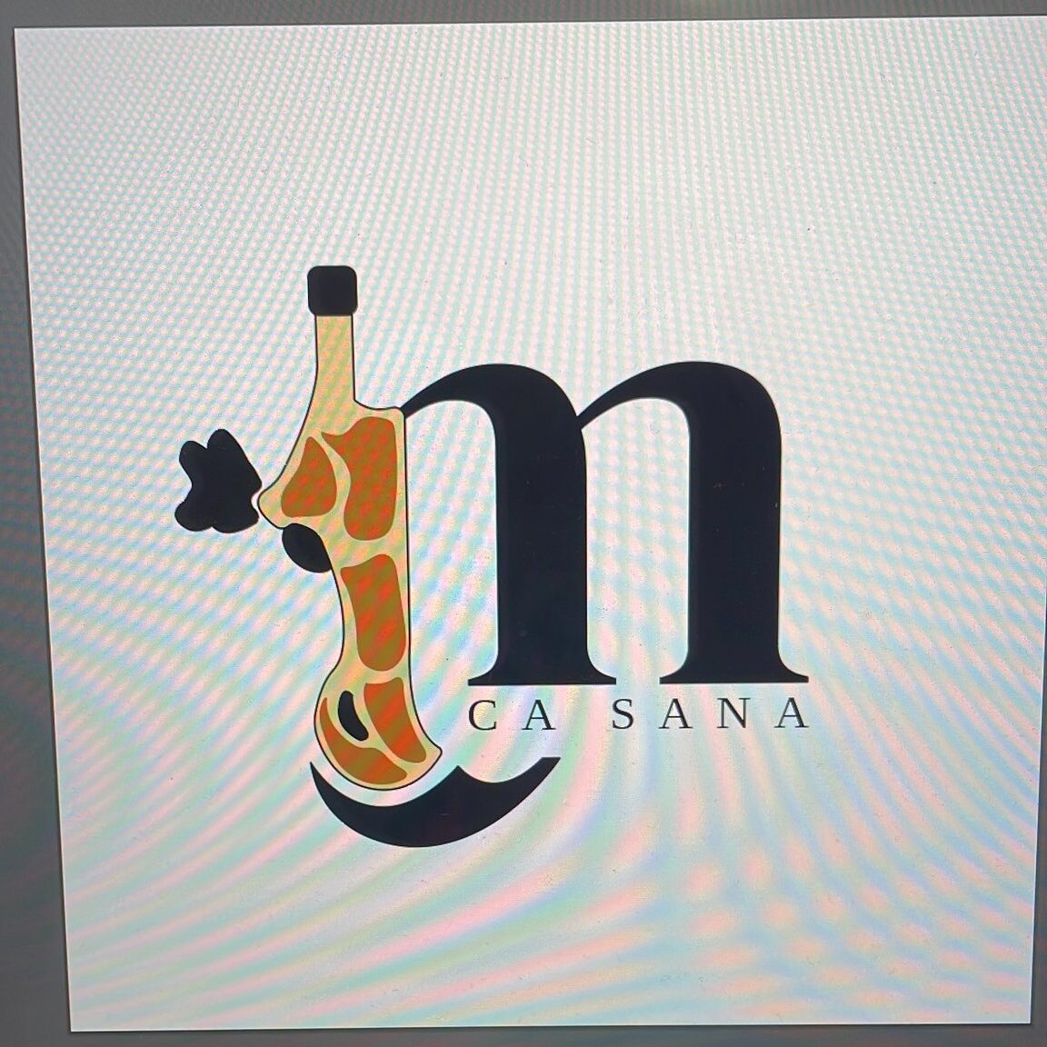
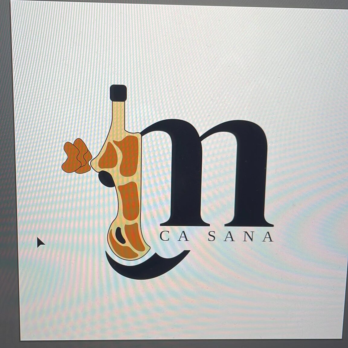
It’s all about experimenting to find the best combination! Some options might look terrible, but that’s the magic of testing them all. In the end, you’ll find the one that simply makes sense.
Final Touches
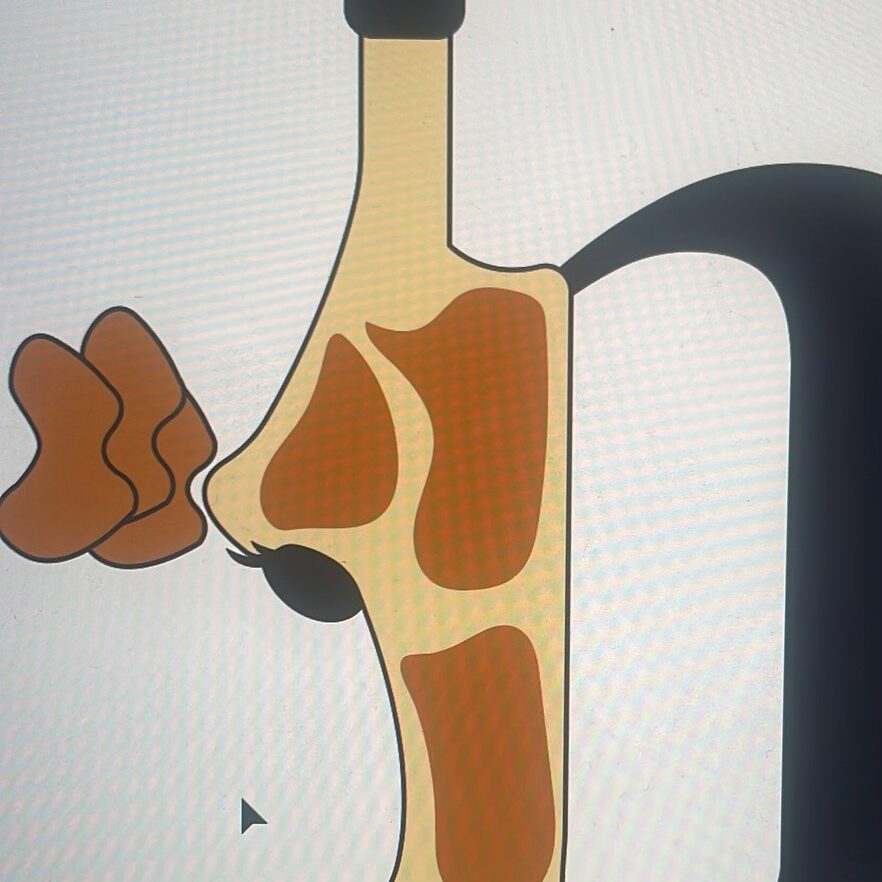
The hotel is run by a woman, and we wanted to add a feminine touch to the giraffe. That’s why we decided to add some eyelashes. This makes the logo feel less intimidating and adds the female touch the brand needed.
Social Media
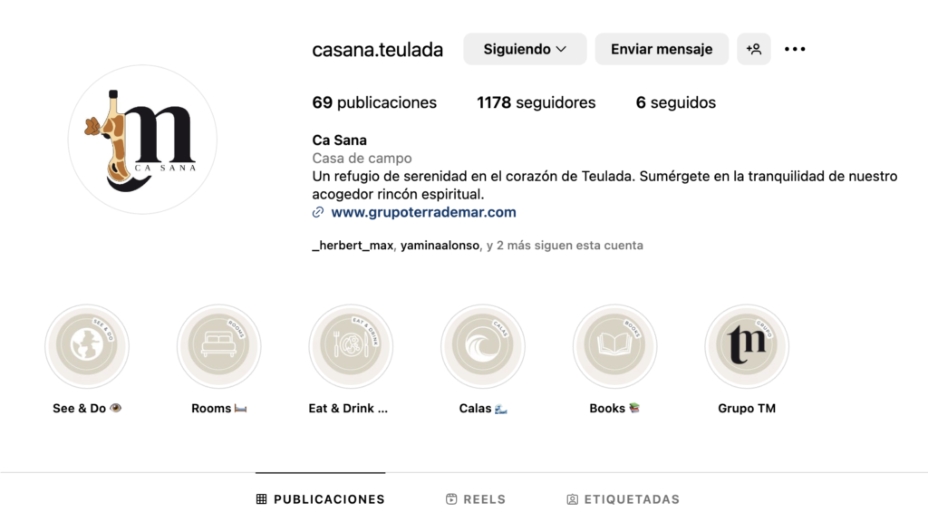
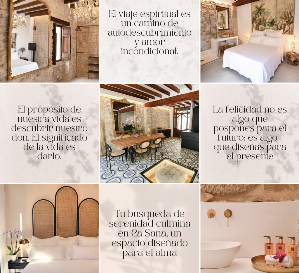
Their strong brand image and effective Instagram management have helped the hostel attract more clients.
Keeping it clean and simple.
